| Wed, 8 Jan 2014
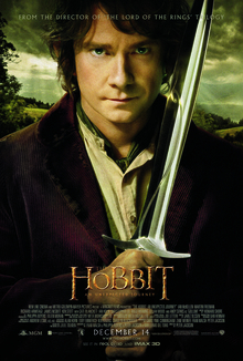
The Hobbit, pt 2
So I went to see The Hobbit, part 2, at the Imax. In 3D, despite my misgivings from last time. It is again a jolly fun romp, and worth seeing. The technology still has problems. Scenes with lots of movement are blurry and juddery. If I didn't know better I'd swear that they'd run out of time on the rendering farm to render all the frames, and so just doubled frames up to drop the effective frame rate from 24 fps to 12 or 18 fps. Apart from this, however, the use of 3D was a lot more effective. It seemed in the previous film that there were only a small number of layers at different distances from the viewer. This time, it looked far more like true 3D. In some sequences it was very effective indeed. However, there are still problems. People often look like 2D cutouts in a 3D scene. I can only assume that this is because Peter Jackson had an attack of the OMGWTF3DBBQLOLLERSKATE and so made all the CGI components (and they're present in most shots to some degree) have more depth than they should. In some cases he went way too far, and while the 3D was very effective it made me a bit dizzy. Yes, spinning and falling down a shaft would do that to a soul, and he recreates the feeling faithfully. However, it needs to be remembered that his film is a work of entertainment, not a training simulator for astronauts, and so he needs to tone it the fuck down. Last time, I was decidedly "meh" about the whole 3D thing, giving the technology just two stars. This time, I can say that it definitely helped in some places. Perhaps the technology has moved on, or perhaps the director and his post-production crew, with a bit more 3D experience under their belts, are simply better at their craft. Whatever the reason, I'm reasonably positive about it, and I now think that 3D can add to a film. This one, however, I think I'd still prefer to watch in 2D. | ||
| Tue, 1 Jan 2013
The Hobbit, in 3d
I've now seen The Hobbit (part 1) in both 2d at the Hastings Fleapit and 3d at the BFI Imax. In 2d the only real complaints I had were that the font used for the film titles and credits hadn't been rendered well - it was all pixelly - and that the font used for subtitles when characters were muttering in Tolkienish was crap. Both of those are fixed in the 3d version. Unfortunately, some other stuff got broken. In those long sweeping shots with lots of movement that Peter Jackson loves so much, everything is just a little bit blurry. Even when there's not much movement, such as in close-ups, it's not quite as crisp as it should be. I believe that this is down to how the 3d system works: the images for the left and right eye are projected slightly offset from each other, and polarised 90° apart. The cheap n nasty plastic glasses you get to wear are polarised so each eye sees the right image. Trouble is, everyone's eyes are slightly different distances apart, and so it's only a very lucky few whose eyes are exactly the right distance apart who will see clearly. A handful of scenes and shots definitely benefitted from 3d, but only a handful. I'll not go out of my way to see a film in 3d again, and nor should you. You should see The Hobbit, but seeing it in 2d is fine. | ||
| Tue, 20 Apr 2010
Film review: Assembly
| ||
| Sun, 18 Apr 2010
Film review: Seven Swords
| ||
| Thu, 15 Apr 2010
Film reviews: The Magnificent Seven and Seven Samurai
| ||
| Thu, 3 Dec 2009
Film review: Shark In VeniceThe lovely Mr. Juan Lemmon reminded me that I need to review Shark In Venice. This is Not A Good Film. It's vaguely enjoyable, once, while drunk, but it lacks quality, in pretty much all departments. This can sometimes be forgiven - I forgive the makers of Mega Shark vs Giant Octopus, because their film is so delightfully over-the-top, cheesy and stupid. Trouble is, Shark In Venice doesn't hit any of those. It's not particularly OTT, at least no more so than an Indiana Jones film; it's not cheesy, taking itself quite seriously and it's obvious that quite a lot of money was spent on it; and it's not even stupid - it's ostensibly no more brainless than a thousand other, better films. If only the film-makers hadn't taken their job so seriously they might have produced something that's actually fun. But no, by being so earnest, they merely emphasised their own incompetence. | ||
| Sun, 29 Nov 2009
Micro film reviewsBrighton Wok: The Warlords: House of Flying Daggers: | ||
| Tue, 1 Sep 2009
Film review: Mega Shark vs Giant Octopus
Update: 2 Sep 2009: it has been brought to my attention that I may have to add a disclaimer that my review of this film was influenced by drugs. Namely two bottles of wine. | ||


